01.09.12
Device Targeted Email Content
Finding a solution to a problem that demanded serving different content to desktop and mobile users …
Finding a solution to a problem that demanded serving different content to desktop and mobile users …
N.B. a better method now exists -see part ii
Last year I discovered a useful technique whilst solving a problem that demanded serving differing content to desktop and mobile users from the same email. It employs similar methods that I've since used to implement Net-a-porter's first adaptive mobile header and footers.
The ctas of an email were directing subscribers to areas of the client's website that could not be accessed properly by mobile and tablet users without an annoying trail of redirects.
The long term solution of replacing the areas of the site that utilised flash wasn't going to happen over night. So the challenge was to come up with an interim solution that enabled an alternate cta for mobile devices (i.e. mail apps which support for media queries)- ipad and iphone being highly popular amongst the subscriber base.
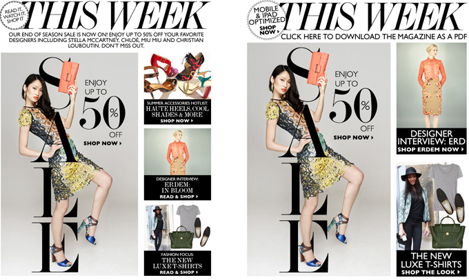
Net-a-porter's Issue Email. On the right the version with alternate cta that appeared for media query friendly mobile apps.
Usually it probably doesn't make a great deal of sense to have a lot of alternate device-specific content in one email. It doesn't really fit with the ethic of streamlining content for mobile either. However the extra kb required wasn't so great that it pushed the download weight up or above the average email in it's field.
In this particular case, it was trialled and subscriber response was enough to validate it as a temporary solution to improve experience and conversion rate/ engagement.
Used judiciously the ability to hide certain content on desktop/webmail clients feels like a useful tool in the armoury.
The solution is not friendly to older versions of Lotus Notes but, in this case, the indications were Lotus users made up was a minimal (>0.05%) proportion of subscribers.
The second caveat is, as there's no javascript employed, the layout changes are occurring client-side so we're manipulating content to appear and disappear using media queries but not preventing it from being downloaded when not required. So mail-app specific content is really what we're creating.
I began by exploring an approach offered by Email on Acid based around wrapping image content in divs that can be displayed or hidden using media queries.
@media only screen and (max-device-width:480px) {
    body[yahoo] .mobile_only {
            width:600px !important;
            overflow:visible !important;
            float: none !important;
             }
    body[yahoo] .desktop_header {
            display:none
        }
}
<body yahoo="fix">
    <div class="mobile_only" style="width:0px;overflow:hidden;float:left">test image for mobile, width="300px"</div>
    <div class="desktop_header">test image for desktop width="600px"</div>
</body>
The stumbling block for this method seemed to be with gmail retaining the space where hidden content exists and also Outlook still displaying the images.
The next thought was to use css to reduce or expand image dimensions depending on the device.
For each img tag that is to be hidden from desktop view within the div wrap sizing is set to width="1". From my tests this seemed to yield better results than width="0" or combinations using height as a parameter . .
For each img tag that is to be hidden from mobile view we can assign a class
In our media queries for each image we end up with something like this:
img[class="img_desktop"] {
width: 0px !important;
height: 0px !important;
}

img[id="img_mobile"] {
width: 300px !important;
height: 156px !important;
}
On desktop/webmail the media queries are ignored and the mobile specific images are hidden or set to a barely visible spec in OL. On mobile the css shrinks the desktop images and expands the mobile images.
This was a surprising passable solution, as a first stab, but it can be improved on...
Things can be made a lot simpler by setting the desktop-only images or their table container to display:none so it doesn't appear on mobile devices (rather than needing to individually target and shrink each individual image).
display:none; within a div wrap also seems to work on Outlook for hiding the images
What I came to was a combination of the two methods which can probably be refined further but at least seems to work and pass inspection on the inbox tests I did.
body[yahoo] .mobile_only {
overflow:visible !important;
width: auto !important;
height:auto !important;
display:block !important;
}
<body yahoo="fix">
    <div class="mobile_only" style="display:none; width:0px; overflow:hidden;"><img  class="mobile_only" src="image.jpg" alt="" width="1"  border="0" style="display:block">
    <div>
</body>
Apart from Lotus notes Some fractional extra 1-2px spacing can result in OL and IE gmail, it's not pretty by any means but it's been a very useful tool.